

The fastest way to build a winning uniform is to pick 2–3 colors: one neutral base, one strong accent, and an optional secondary. That’s it. Keeping your palette to two or three colors prevents visual clutter, makes numbers readable from the stands, and gives your brand room to breathe.
Two combos that work across almost any sport:
- Classic: Navy + White + Gold — navy base jersey, white numbers with gold outline, gold trim on collar and cuffs. Reads cleanly under gym lights and photographs well on green fields.
- High-visibility: Black + Neon Yellow-Green — black base, #CCFF00 accent numbers and piping. Stands out on ice, turf, and hardwood. Strong for night games or broadcast.
Before you finalize any palette, run these three checks:
- Logo contrast: Place your logo on the jersey color. Can you read it at arm’s length?
- Number readability: Print a test number at game size. Check it from 20 feet.
- Field/court contrast: Hold a swatch next to your playing surface. Your jersey should not blend in.
Key Takeaways
Limiting your palette to two or three colors with strong contrast between the base and numbers is the single most reliable rule for building team color uniform combinations that work across every sport and venue.
| Point | Details |
|---|---|
| Use 2–3 colors maximum | One neutral base, one strong accent, one optional trim color keeps the palette readable and on-brand. |
| Contrast drives number readability | Dark-on-light or light-on-dark number combinations read clearly from the stands and in photos. |
| Test under real lighting | Photograph a physical sample under your venue’s lights before approving a full production run. |
| Order a practice run first | A small test batch validates color durability, fit, and number legibility before the full kit investment. |
| Rnkapparel for hockey kits | Rnkapparel offers custom hockey apparel with color selection, logo upload, and name/number options for U.S. teams. |
Table of Contents
- Why your uniform color choices affect more than just looks
- Sport-by-sport palette guidance
- The rules that make any palette work
- Ready-to-use palettes by mood
- How color generators and palette tools actually work
- Ordering checklist: from palette to finished uniforms
- How Rnkapparel helps teams go from palette to product
- The mistake most coaches make with uniform color
- Rnkapparel makes custom hockey kits straightforward
- Sources
Why your uniform color choices affect more than just looks
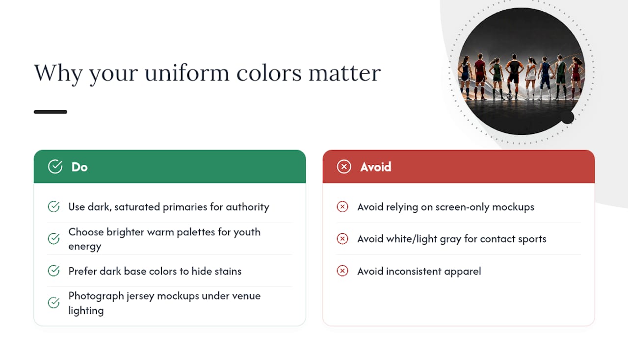
Color does real work on a sports team. It affects how officials spot your players in a pile, how parents find their kid in a team photo, and how recruits perceive your program before they ever watch a game. Consistent, cohesive apparel also reinforces team morale and identity, which matters more than most coaches expect.
The psychology is well-documented. Colors such as blue, red, and yellow each convey different psychological impressions. A team that wants to project authority on the ice or field should lean into dark, saturated primaries. A youth program focused on energy and fun can afford brighter, warmer palettes.
Practical durability matters too. Dark base colors — navy, black, forest green — hide soil and grass stains far better than white or light gray. For high-contact sports where jerseys hit the turf regularly, a dark base is a practical call, not just an aesthetic one.
Pro Tip: Photograph your jersey mockup under the actual lighting of your home venue before you order. Gym fluorescents flatten colors; rink lighting shifts whites toward blue. A palette that looks sharp on screen can look washed out under arena lights.
Sport-by-sport palette guidance
Every sport has its own backdrop, lighting, and contrast challenge. Here’s what actually works by sport.
Hockey
The rink is white ice under bright overhead lights. Your jersey needs to pop against that background, which means dark bases dominate home kits. Sport-specific palettes influence perceived aggression and visibility on the field or ice, and hockey is where dark-vs-light contrast is most critical.
- Classic: Red + White + Black (#CC0000 / #FFFFFF / #000000) — home in red, away in white
- Bold: Royal Blue + Orange + White (#003087 / #FF6600 / #FFFFFF)
- High-visibility: Black + Neon Green + White (#000000 / #39FF14 / #FFFFFF)
For youth hockey specifically, Rnkapparel’s coach-focused design guide covers palette choices that hold up through a full season of washing and contact.
Football
Green turf is your backdrop. Avoid green jerseys unless your accent colors create strong separation. Helmets add a third color element, so keep jersey and pants to two colors max.
- Classic: Navy + White (#001F5B / #FFFFFF)
- Bold: Scarlet + Black + Gray (#CC0000 / #000000 / #808080)
- High-visibility: Safety Orange + Black (#FF6600 / #000000)
Soccer
Outdoor fields vary from bright green to brown late-season turf. White and light gray away kits work universally. Home kits can go darker.
- Classic: Royal Blue + White (#4169E1 / #FFFFFF)
- Bold: Forest Green + Gold + White (#228B22 / #FFD700 / #FFFFFF)
- Modern: Charcoal + Teal + White (#36454F / #008080 / #FFFFFF)
Basketball
Hardwood courts are light tan or dark wood. Both light and dark jerseys work, but number contrast is critical — officials call fouls and track players by number, so readability is non-negotiable.
- Classic: Black + Gold + White (#000000 / #FFD700 / #FFFFFF)
- Bold: Purple + Gold (#5B2C8D / #FFD700)
- High-visibility: White + Red + Navy (#FFFFFF / #CC0000 / #001F5B)
Baseball
Green outfield grass and red-brown infield dirt create a complex backdrop. White home jerseys are traditional and work well. Gray road jerseys photograph cleanly against both surfaces.
- Classic: Navy + White + Red (#001F5B / #FFFFFF / #CC0000)
- Bold: Black + Vegas Gold + White (#000000 / #C5A028 / #FFFFFF)
- Modern: Powder Blue + Navy + Red (#B0C4DE / #001F5B / #CC0000)
Lacrosse
Lacrosse is played on grass or turf with helmets and pads adding visual bulk. Keep jersey colors bold enough to read through equipment.
- Classic: Maroon + White + Gold (#800000 / #FFFFFF / #FFD700)
- Bold: Kelly Green + White + Black (#4CBB17 / #FFFFFF / #000000)
- High-visibility: Orange + Black + White (#FF6600 / #000000 / #FFFFFF)
The rules that make any palette work
The 3-color rule
Practical uniform programs limit palettes to three colors, and there’s a clear reason: each color has a job.
- Primary (base): The dominant jersey or pant color. Should cover 60–70% of the garment.
- Secondary (accent): Numbers, stripes, collar trim. Should cover 20–30%.
- Tertiary (logo/piping): Logo outline, piping, small details. 10% or less.
Four or more colors almost always creates visual noise. The identity gets muddy, and production costs rise because each additional color adds a print pass or embroidery color charge.
Contrast and number readability
The practical test: can a parent in the top row of the bleachers read your player’s number? White numbers on a black jersey pass. Yellow numbers on a white jersey fail. The contrast ratio between your number color and jersey base should be as high as possible. Dark-on-light or light-on-dark always beats medium-on-medium.
Color-blind accessibility
Roughly 8% of men have some form of color vision deficiency, which affects officials, fans, and sometimes players. The most common issue is red-green confusion. Avoid pairing red and green as your two primary colors without a strong neutral separator. A free tool like Coblis (Color Blindness Simulator) lets you upload a jersey mockup and see how it reads across different deficiency types.
Quick checklist before you finalize:
- Does the palette use three colors or fewer?
- Is your number color high-contrast against the jersey base?
- Does your logo read clearly on both home and away jerseys?
- Have you tested the palette under your venue’s actual lighting?
- Does the palette avoid red-green-only contrast without a neutral buffer?
Ready-to-use palettes by mood
These palettes are organized by the feeling they project. HEX values are included so you can drop them directly into a uniform builder or share them with a decorator.
Classic / Traditional
| Palette Name | Base | Accent | Trim | Best For |
|---|---|---|---|---|
| Navy Standard | #001F5B | #FFFFFF | #C5A028 | Hockey, baseball, football |
| Maroon & Gold | #800000 | #FFD700 | #FFFFFF | Football, lacrosse, basketball |
| Forest & White | #228B22 | #FFFFFF | #000000 | Soccer, baseball |
Energetic / Bold
Modern / Muted
High-Visibility / Safety
Classic palettes build long-term identity. High-visibility palettes win on broadcast and in low-light venues. Bold palettes project aggression and energy, which research links to perceived dominance on the field. Modern/muted palettes photograph well and tend to age better across kit generations.
How color generators and palette tools actually work
Most online palette generators take a single input color and produce complementary, analogous, or triadic combinations based on color wheel relationships. Adobe Color, Coolors, and Canva’s palette tool all work this way. They’re useful for finding accent colors you wouldn’t have thought of, but they don’t account for contrast on a jersey or visibility under sport-specific lighting.
Here’s a workflow that actually produces usable results:
- Set your neutral base first. Enter your primary jersey color (navy, black, forest green) into the generator.
- Generate accent options. Look at complementary and split-complementary results. Pick one that has strong contrast against your base.
- Run a contrast check. Paste your base and accent HEX values into WebAIM’s Contrast Checker. Aim for a ratio above 4.5:1 for numbers.
- Export swatches. Download the HEX values and drop them into a jersey mockup tool.
- Test on a mockup. Real-time uniform builders let teams preview colors on templates before ordering, which catches problems that look fine in a color swatch but fail on an actual jersey shape.
- Order a sample swatch or printed test. Never approve a full run from a screen preview alone.
The mockup step is where most teams skip ahead and regret it. A color that looks bold on a flat swatch can look muddy on polyester mesh under fluorescent light.
Ordering checklist: from palette to finished uniforms
Turning a palette into actual garments has its own failure points. Work through these in order.
- Request physical swatches for every color in your palette before approving anything.
- Test colorfastness by washing a swatch three times and checking for fading or bleeding. Dark dyes on polyester can bleed onto white trim if the fabric isn’t properly set.
- Print a test number in your chosen number color on a jersey-colored background. Check it from 20 feet.
- Confirm logo colors with your decorator. Embroidery thread colors don’t match screen-print inks exactly. Get a physical sample of both.
- Review a sample garment before the full run. Check fit, color accuracy, and number placement.
- Plan your alternate kit. If your home jersey is dark, your away should be light. Confirm the away palette uses the same accent and trim colors.
- Set your reorder strategy. Note the exact color codes your decorator used so future orders match.
A note on printing methods: screen printing gives you the sharpest color on cotton but has limited color range on dark fabrics. Embroidery is durable but thread colors are limited and can look different from PMS or HEX references. Dye-sublimation produces the most accurate colors and works well on polyester, but requires a full-coverage print and doesn’t work on cotton.
Pro Tip: Order a small run of practice jerseys in your chosen palette before committing to game-day kits. Wear them through a few practices to check for color durability, number legibility under sweat and movement, and player comfort. It’s a low-cost way to validate the palette before the full investment.
For fabric-specific guidance that affects how colors hold up across a season, Rnkapparel’s fabric selection guide for youth hockey uniforms covers the practical tradeoffs in plain terms.
How Rnkapparel helps teams go from palette to product
Rnkapparel offers custom hockey apparel with full color selection, logo upload, and player name and number customization. The workflow is straightforward: pick your palette from the options available, upload your team logo, specify player names and numbers, and approve a mockup before the order goes into production.
That mockup step matters. It’s where you catch a logo that doesn’t read against your jersey base, or a number color that looked fine in a swatch but disappears on the actual garment.
Rnkapparel’s coach-focused design resources give sport-specific guidance for hockey teams working through palette decisions, including how to handle home/away contrast and how to extend palette consistency across hoodies, warmups, and accessories.
Pro Tip: When ordering a team run, use the same HEX values for every garment type — jerseys, hoodies, and training tees. Palette drift across garment types is one of the most common complaints coaches have after a full kit order.
The mistake most coaches make with uniform color
The most common misstep isn’t picking the wrong colors. It’s picking too many of them. A coach adds the school color, then a second school color, then a trim color from the logo, then a separate number color, and suddenly there are five colors on one jersey. None of them read clearly because none of them dominate.
The fix is almost always subtraction. Take the palette down to two colors and add the third only if it serves a specific function — logo outline, number drop shadow, collar trim. If you can’t explain why the third color is there, it shouldn’t be there.
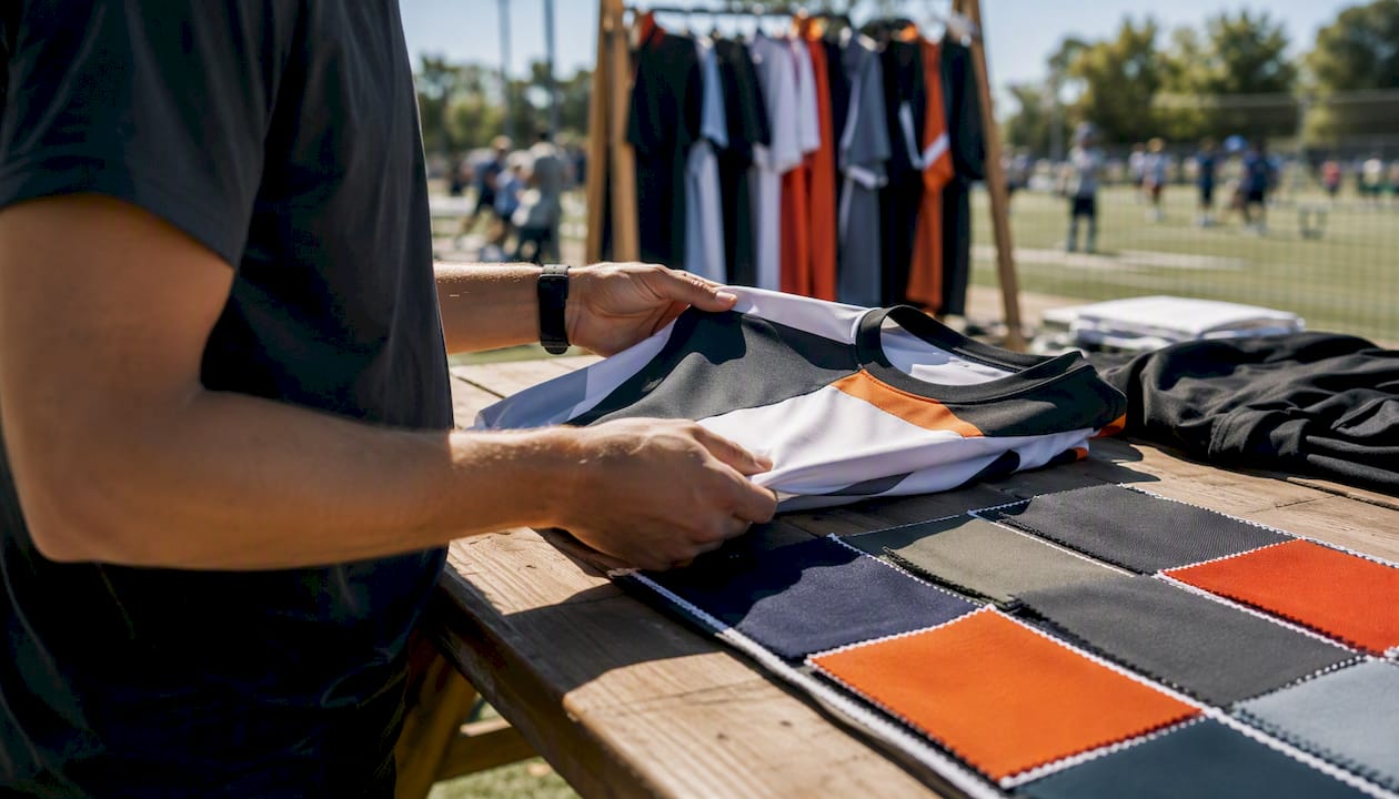
The other consistent mistake is skipping the photo test. Uniforms live in photos: team portraits, game-day shots, social media. A palette that looks sharp in person can look flat or muddy in a JPEG. Before finalizing, photograph a mockup or a sample garment and look at it on your phone screen. That’s how most people will see it.
One palette tweak that consistently improves readability: add a thin white or black outline to your numbers, even when the base contrast seems sufficient. That outline creates a hard edge that reads clearly across lighting conditions and photo compression.
The habit worth building: always test your palette in a photo before you order. Not a render. A real photo of a physical sample, under real light.
Rnkapparel makes custom hockey kits straightforward
When you’ve settled on a palette and you’re ready to put it on actual garments, Rnkapparel is built for exactly that step. Custom hockey apparel with color selection, logo upload, and player name and number options means your palette goes from HEX codes to finished product without the back-and-forth that slows most team orders down.
Rnkapparel serves teams across the United States, with options for youth and adult sizes, bulk team orders, and accessories that extend your palette across the full kit. The ordering process starts with a mockup, so you see exactly what you’re getting before production begins. Browse the full range and start your team order at Rnkapparel.
Sources
These resources are worth bookmarking as you work through your palette decisions.
- Uniform Colors Selection Guide - Boost Brand Image with Lands’ End Outfitters | Lands’ End Outfitters
- Explore the Best Uniform Color Combinations for Your Brand | Work Hard Dress Right
- Best Uniform Colors: A Guide to Choosing the Right Hue
- Psychology of Colors in Sports Uniforms
- Baseball Uniform Builder — Design Your Team | Tater – Tater Baseball®
