

For legible, production-ready jersey lettering, start with Jersey M54 (free, Dafont), Jersey 25 (free, Google Fonts), Tourney, and VT Redzone Classic (paid). Jersey M54 and Jersey 25 cover free personal use, but commercial team merch usually needs a separate license from the author. Download your pick, test it at your actual nameplate height, then loop in a stitch or twill vendor before you commit to a full team order.
TL;DR:
- Free fonts like Jersey M54 and Jersey 25 are suitable for mockups but require commercial licenses for team merchandise.
- Condensed, bold fonts with open counters, such as VT Redzone Classic, are most legible and durable on stitched jersey nameplates.
- Proper licensing checks are essential before mass printing to avoid costly takedown notices, with licenses best obtained in writing for bulk orders.
- Digital font designs must be simplified, tested at real size, and converted to outlines to ensure quality and legibility when cutting or embroidering.
- Stitched twill nameplates outperform heat-pressed vinyl in durability and are recommended for contact sports, while heat press is suitable for short-term or low-budget projects.
Table of Contents
- Jersey Name Fonts: The Curated Shortlist
- What “Free” Actually Means for Jersey Fonts
- Choosing a Jersey Font for Legibility
- Cutting Jersey Fonts on a Cricut: Steps and Sizing
- Twill vs Heat Press for Jersey Nameplates
- An Insider’s Take on Font and Fabric Pairing
- The Backstory Behind Jersey-Style Fonts
- Adding Outlines, Shadows, and Effects to Jersey Fonts
- Baseball, Football, and Hockey Font Traditions Compared
- Matching Name Fonts With Number Fonts
- What’s Trending in Jersey Fonts Right Now
- An Editorial Take on Font Selection for Real Jerseys
- Get Professional Stitched Nameplates Without the DIY Guesswork
- Sources
Jersey Name Fonts: The Curated Shortlist
Picking a jersey font isn’t about finding the flashiest display face. It’s about finding letterforms that survive a heat press, a sewing machine, and a shaky sideline camera. Here’s a working shortlist, split by license type so you know what you’re getting into before you download anything.
Free fonts (check commercial terms before selling merch):
- Jersey M54 — the classic slab-style jersey face, widely used for player names and numbers. Hosted on Dafont, free for personal use, but the listing itself flags that commercial use requires contacting the author.
- Jersey 25 — a knit-inspired family on Google Fonts, built with jersey and sweater knit charts in mind, which makes it a natural fit for apparel mockups and printable patterns.
- Tourney — a bold, condensed sans that Creative Bloq recommends for jerseys, signage, and team branding because it holds up across formats without losing its edge.
- Broader collections like FontSpace’s jersey category offer dozens more options, though most are personal-use only until you pay for a license.
Paid or commercial-license fonts:
- VT Redzone Classic — a chunky, stencil-adjacent style built for scoreboard and jersey work, also singled out by Creative Bloq as a strong all-purpose sports face. Buying the commercial license upfront saves you from chasing down permissions after a team order ships.
- Foundry-licensed alternatives to Tourney and VT Redzone Classic exist for shops that print or embroider at volume and want indemnification built into the purchase.
Best for numbers versus best for names isn’t always the same font. Jersey M54 and Tourney both read cleanly at nameplate size, but for numbers alone, a slightly wider, boxier face like VT Redzone Classic often survives the jump to a jumbotron or a livestream feed better. If you’re cutting on a Cricut, Jersey 25’s cleaner counters make weeding vinyl less of a headache than a more decorative script would be.
What “Free” Actually Means for Jersey Fonts
A font marked “free” on a download site almost never means free for everything. Most hosts split rights into personal use (fine for a mockup, a practice jersey, a one-off gift) and commercial use (selling merch, printing for a paying team, embroidering for a client). Some go further and separate desktop use from web embedding or app bundling, which matters if you’re building an online customizer rather than just printing shirts.
Before you commit a font to a full team order, run this three-step check:
- Read the EULA on the hosting site. Dafont listings, for example, usually state outright whether commercial use needs the author’s permission.
- Get it in writing. If the license page is vague, email the designer and keep their reply. A one-line “yes, commercial use is fine” is worth more than assuming.
- Keep records for bulk orders. If you’re printing a bulk order of jerseys, save your license confirmation or purchase receipt in case a supplier or league asks for proof.
Pro Tip: If a team is planning to resell jerseys as merch, not just outfit its own roster, spend the $15 to $40 on a properly licensed commercial font instead of gambling on a free one. A takedown notice mid-season costs far more than the license.
Choosing a Jersey Font for Legibility
Style matters less than survivability. A font that looks great on a poster can fall apart the moment it’s stitched at 8 inches tall and viewed from the upper deck. Design authorities point to a short list of traits that separate a usable jersey font from a decorative one: condensed proportions, bold weight, and open counters that keep letters distinct at distance.
- Condensed proportions fit more characters into a fixed nameplate width without shrinking the letters themselves.
- Bold or heavy weight holds up under broadcast compression and low-resolution phone video, where thin strokes tend to vanish entirely.
- Open counters (the enclosed spaces inside letters like “A,” “O,” and “R”) keep letters readable even when stitched thread fills in slightly at the edges.
- Distinct numerals matter as much as letters. A “3” and an “8” that look nearly identical at 40 yards is a real problem for officials and broadcasters.
- Simple terminals, meaning clean stroke endpoints rather than curls or flourishes, reduce thread bunching on embroidered plates.
A hollow-centered or ultra-thin script might read fine on a laptop screen and disappear completely on a jumbotron. That’s the gap between a headline font and a jersey font: one is built for a static page, the other for movement, distance, and fabric. Design guidance from Fontfabric also recommends pairing a decorative name font with a simpler, more geometric font for scoreboard numbers, since one typeface rarely nails both jobs at once.
Cutting Jersey Fonts on a Cricut: Steps and Sizing
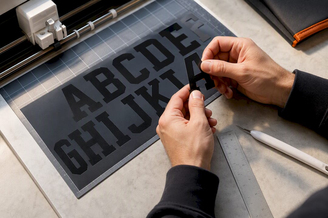
Getting a digital font onto fabric cleanly takes a bit of prep work, whether you’re running a home Cricut or sending files to a stitch shop.
- Convert text to outlines in your design software so the font behaves as shapes, not editable text, before cutting.
- Weld overlapping letters together if you’re cutting a full name as one piece, which prevents floating fragments during vinyl weeding.
- Simplify decorative glyphs and remove hairline details or tiny enclosed counters that a blade or cutter can’t reproduce cleanly.
- Test at real size first. A 2-inch sample lets you check how counters and thin strokes behave before committing an entire team’s order.
- Export in the right format: SVG or EPS for vinyl cutters and plotters, PNG or TIFF at high resolution for heat-transfer printing.
For sizing, practice jersey nameplates typically run smaller than game-day plates, while stitched twill plates for replica or pro-style jerseys tend to run larger to stay legible at distance. Numbers are usually sized larger than names since they need to be readable from farther away.
Pro Tip: Run a full QA pass before ordering: check spacing between letters, confirm no counters have closed up in the cut file, and print one physical test piece before you commit to a 20-jersey run.
Twill vs Heat Press for Jersey Nameplates
The choice between stitched twill and heat-pressed lettering comes down to how much contact and washing the jersey will see. Tackle twill nameplates are cut to order and machine-stitched directly onto the fabric, which makes them far more resistant to checking, cracking, and physical abrasion during play.
- Twill fits contact sports. Hockey, football, and other high-contact games put real stress on lettering, and stitched plates hold up through repeated washing and checking against the boards in a way heat-pressed vinyl often doesn’t.
- Heat press fits short runs and lower budgets. A one-off fan shirt, a practice jersey, or a rec league order with a tight turnaround is a fair use case for heat transfer.
- Turnaround differs. Stitched twill orders typically take longer to produce and carry per-name pricing, since each plate is cut and sewn individually rather than pressed in a batch.
If durability matters more than speed, twill is the safer call. If you need shirts on a deadline for a one-time event, heat press gets the job done without the wait.
An Insider’s Take on Font and Fabric Pairing
Font choice and fabric choice aren’t separate decisions. A heavier fabric weight, measured in GSM, holds a bolder stitched font better than a lightweight jersey knit, which can pucker under dense embroidery. For hockey and other contact sports, twill nameplates paired with a bold, condensed font hold up best over a season of games and washes.
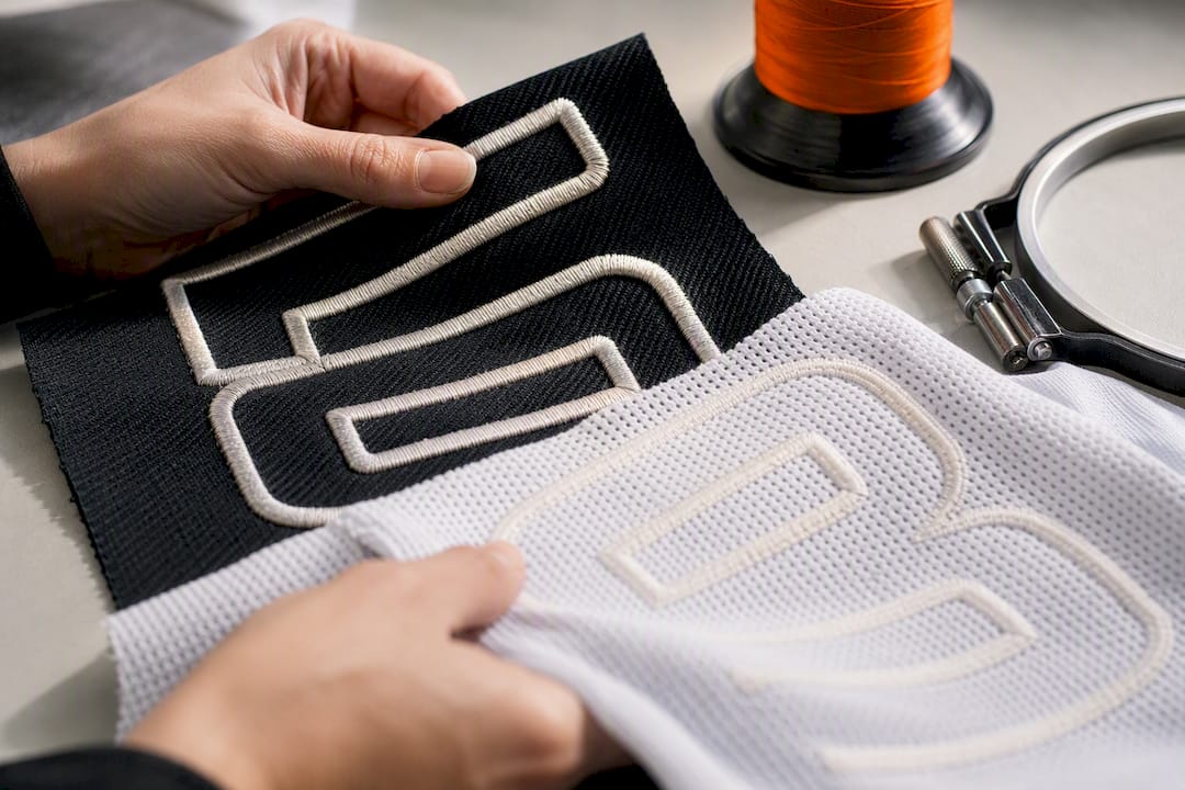
Skip ultra-condensed display faces for stitched work. Their thin strokes and tight counters tend to distort once thread fills them in. Run a single test jersey through your chosen customizer before committing an entire roster’s order.
The Backstory Behind Jersey-Style Fonts
Jersey lettering didn’t come from type foundries chasing a trend. It grew out of stitched athletic numerals from the early 20th century, when college and pro teams needed simple block numbers that a seamstress could sew accurately by hand. Curves and serifs were a liability. Straight strokes and blocky counters were forgiving for hand-cut felt or twill applique.
By the mid-1900s, mass production and screen printing pushed jersey typography toward the bold, slightly condensed block letters most fans now associate with baseball and football jerseys. That look stuck because it worked on television just as well as it worked in the stands, and it survived the jump from felt applique to vinyl heat transfer and machine embroidery without much redesign.
Digital type foundries eventually formalized these shapes into downloadable fonts, which is why so many “jersey” style fonts on sites like Dafont and Google Fonts share a family resemblance: slightly rounded corners, uniform stroke width, and numerals designed to be told apart at a glance. Modern releases like Jersey 25 lean into that same knit-and-stitch heritage rather than inventing a new look from scratch, which is partly why it reads as instantly familiar even to people who’ve never designed a jersey before.
That history explains why so few genuinely new jersey fonts show up each year. The format has been solved for legibility purposes for decades. Most new releases are variations on proportion and weight rather than a wholesale rethink of the letterforms.
Adding Outlines, Shadows, and Effects to Jersey Fonts
A base jersey font is a starting point, not the finished look. Most teams add at least one effect layer to make lettering pop against a solid jersey color, and the right effect depends heavily on production method.
Outlines are the most common addition, usually a contrasting color stroke around each letter that keeps names readable against a similarly colored jersey body. For embroidery, outlines typically get stitched as a separate thread color rather than a true vector stroke, so check with your vendor about how many thread colors your budget allows.
Drop shadows add depth for printed or heat-pressed designs, but they rarely translate well to twill, since a stitched shadow layer adds cost and can blur at small sizes. Save shadow effects for flat-printed graphic tees or fan merchandise rather than game-day nameplates.
Gradient fills and metallic effects work fine on digital mockups and printed products but don’t exist in embroidery. If you’re designing for both a printed shirt and a stitched jersey from the same artwork, build two versions: one with the full effect stack for print, one simplified to flat color and outline for stitching.
Bevels and 3D extrusions show up often in fan-facing graphics and team logos but almost never on the jersey itself. They’re best reserved for marketing assets, not the nameplate a player actually wears.
Baseball, Football, and Hockey Font Traditions Compared
Every sport has its own unwritten rules about jersey lettering, shaped by decades of broadcast convention as much as by fabric constraints.
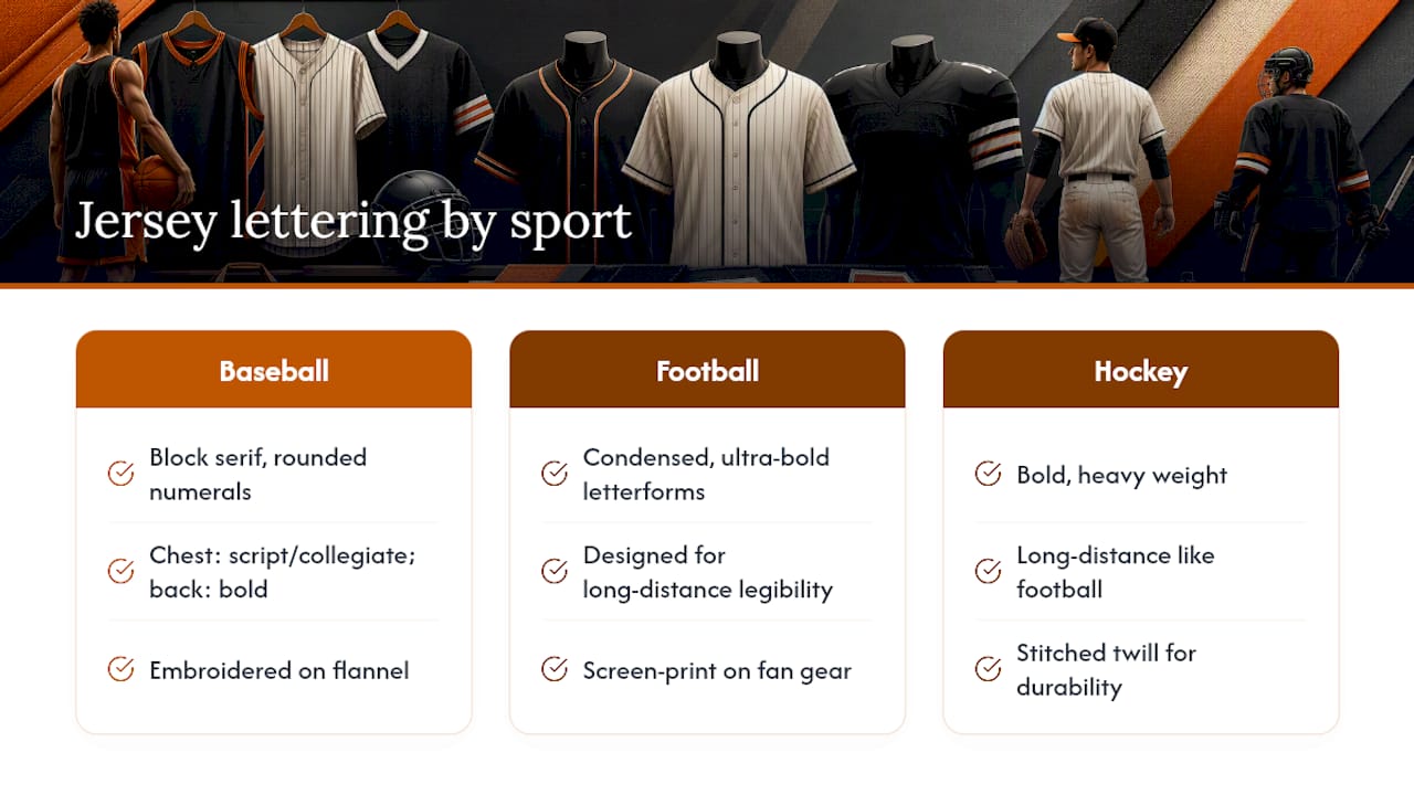
Baseball leans toward classic block serifs and slightly playful, rounded numerals, a holdover from decades of embroidered flannel uniforms. Team names on the chest often use a script or collegiate style, while the back stays simple and bold for umpire and fan visibility.
Football favors the boldest, most condensed letterforms of any major sport, since names and numbers need to read at a full stadium’s distance and through fast-moving broadcast cameras. This is where fonts like Tourney and VT Redzone Classic earn their reputation, built specifically for that kind of high-contrast, high-distance legibility.
Hockey sits closer to football in weight and boldness but adds a durability constraint football doesn’t face in the same way: constant contact with the boards, other players, and ice spray. That’s part of why stitched twill dominates hockey nameplates specifically, rather than the screen printing more common in casual football or basketball fan gear.
Picking a font that ignores your sport’s convention isn’t necessarily wrong, but it does mean fans and officials have to work harder to read it, since they’re primed by decades of visual habit to expect a certain look per sport.
Matching Name Fonts With Number Fonts
Names and numbers on the same jersey don’t need to be the exact same font, but they do need to look like they belong to the same family. Mismatched styles, a rounded script name paired with a blocky slab number, read as a mistake rather than a design choice.
The safest approach is picking one font and using it for both, provided its numerals are as legible as its letters. Not every jersey font nails both: some prioritize decorative letterforms and treat numbers as an afterthought, with numerals that are hard to tell apart at distance. Before committing, check the numeral set specifically, not just the alphabet.
If you split fonts, keep weight and width consistent. A bold condensed name paired with a bold condensed number face reads as intentional. A bold name paired with a thin, wide number face reads as leftover from two different projects. Stick to one or two fonts across the whole jersey, including any sponsor text or team wordmark, so the final look feels designed rather than assembled.
What’s Trending in Jersey Fonts Right Now
Recent seasons have leaned harder into retro-inspired block lettering, pulling from 1970s and 1980s varsity styles rather than the ultra-sharp, futuristic condensed faces that dominated the early 2010s. Throwback jersey drops across multiple sports have driven demand for rounder, friendlier numerals that echo old stitched felt numbers rather than sharp digital-era geometry.
At the same time, hybrid styles that mix a slightly rough, hand-stitched texture with otherwise clean modern proportions have gained traction, especially in streetwear-adjacent fan apparel where the line between “jersey” and “graphic tee” keeps blurring. That crossover shows up in broader streetwear design trends too, where bold typography borrowed from athletic uniforms has become a mainstay of casual apparel far outside the locker room.
Expect this pull between nostalgia and clean modern legibility to keep shaping new font releases. Foundries are increasingly designing jersey-style faces with both looks baked into a single family, offering a rounder “retro” variant and a sharper “modern” variant so teams can pick a mood without switching typefaces entirely.
An Editorial Take on Font Selection for Real Jerseys
Most guides treat jersey fonts as a style decision first and a production decision second. That’s backward. The fonts worth recommending are the ones that survive contact with an actual sewing machine or heat press, not just the ones that look sharp in a mockup.
The biggest gap between advice and reality is licensing. Plenty of guides list free fonts without flagging that “free” usually means “free until you try to sell something.” Teams that skip the licensing check are the ones who get an unpleasant email mid-season.
If there’s one priority to take from all this: pick your production method first, then choose the font. A font that’s perfect for a Cricut cut might buckle under twill embroidery, and a font built for stitching might look clunky on a printed fan shirt. Match the tool to the fabric, not the other way around.
— Eric
Get Professional Stitched Nameplates Without the DIY Guesswork
Cutting your own vinyl or hunting for a properly licensed font works fine for a one-off shirt, but a full team order raises the stakes fast. Some custom hockey apparel providers handle stitched twill and font pairing decisions as part of their service, so a coach or team manager may not have to become a typography expert to get consistent, durable nameplates across a whole roster.
Rnkapparel’s custom ordering covers everything from graphic hockey tees to full team hoodie runs, with logo, name, and number placement built into the ordering flow rather than left to guesswork. If your team needs matching sizing and font consistency across dozens of jerseys instead of trial-and-error at home, consider starting with a hockey graphic tee collection and requesting a team quote.
Sources
- The best fonts for football kits design - Fontfabric
- The best sports fonts for use on jerseys, signage and logos | Creative Bloq
- Dafont
- Custom Jersey Nameplate, Fully Stitched - Twillworks
