Logo placement on team jerseys is defined as the deliberate positioning of team crests, sponsor marks, and manufacturer logos on specific areas of a jersey to maximize brand recognition, team identity, and sponsorship visibility. The role of logo placement on team jerseys goes far beyond aesthetics. Where a logo sits on a jersey determines how fans read the uniform, how sponsors measure their return, and how athletes feel wearing it. Brands like Nike and Adidas have spent decades refining placement standards. Coaches and managers who understand these conventions make smarter design decisions and avoid costly reorders.
What are the common logo placement options on team jerseys?
Logo placement on jerseys follows well-established conventions, and each location carries a different branding weight. Knowing the difference between chest, sleeve, and back placement helps you build a jersey that works for your team and your sponsors.
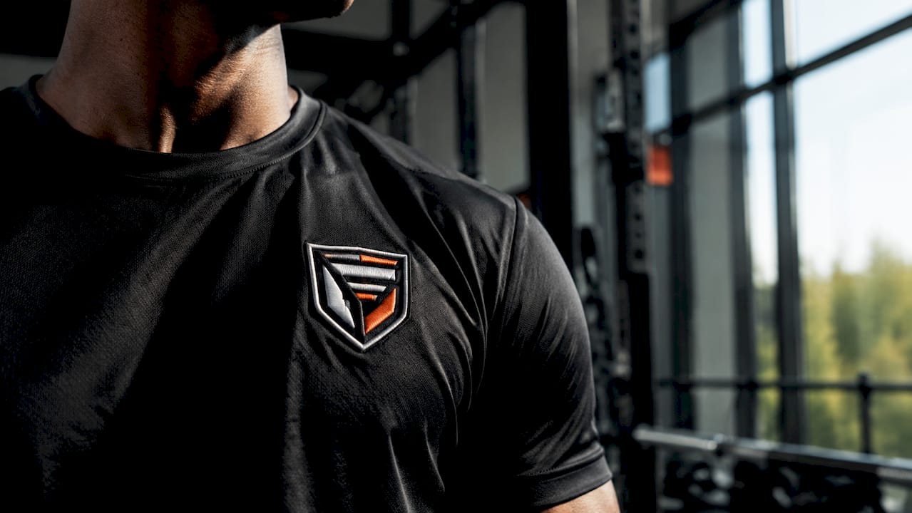
Left chest placement
The left chest is the traditional home for the team crest in sports. Human gaze naturally biases toward the left chest, which increases how important viewers perceive a logo to be. That bias is not accidental. Military uniform traditions originally established the left chest as the place of honor, and sports adopted the convention directly. The symbolic reading is clear: the crest sits “over the heart,” signaling loyalty and identity. For hockey teams, youth programs, and competitive leagues alike, the left chest crest remains the single most recognized placement on any jersey.
Full chest and center chest placement
A full chest or center chest logo trades tradition for raw visual impact. This placement dominates the jersey’s largest visible surface, making it the preferred spot for main sponsors in professional leagues. Kit manufacturers like Adidas and Nike typically place their own brand logo on the right chest, directly opposite the team crest. Main sponsors then occupy the center front, often on the stomach area, where they capture the most broadcast camera time. For amateur and youth teams without major sponsors, a large center chest team logo creates a bold, unified look that reads clearly from the stands.
Sleeve and back placement
Sleeves and the back of the jersey serve a secondary but important function. Secondary sponsors, league patches, and additional branding elements live here without competing with the primary team identity on the chest. Sponsor logos placed on sleeves or back keep the team logo dominant while still giving sponsors meaningful visibility. The back also carries player names and numbers, so any logo placed there must be sized carefully to avoid crowding.
Comparison: logo locations and branding effectiveness
| Placement | Primary use | Visibility | Tradition |
|---|---|---|---|
| Left chest | Team crest | High, gaze-biased | Strong |
| Right chest | Manufacturer logo | High | Moderate |
| Center front | Main sponsor | Very high | Sponsor-driven |
| Sleeve | Secondary sponsor | Moderate | Common |
| Back upper | League or secondary logo | Moderate | Varies |
| Back lower | Additional sponsor | Low to moderate | Rare |
![]()
How does logo placement affect wearer comfort and jersey design?
Logo placement is not only a branding decision. It directly affects how a jersey performs on the body during play. A logo printed across a high-flex area like the shoulder or underarm can crack, peel, or restrict movement if the wrong method is used.
Sublimation printing is the preferred method for vibrant, detailed graphics on jerseys. Unlike screen printing, sublimation bonds dye directly into the fabric, so there is no raised surface to crack or peel. This makes it ideal for large chest logos, full-color crests, and any design that covers a significant portion of the jersey. For smaller logos on sleeves or collars, embroidery or heat transfer vinyl are common alternatives, though both add slight texture that some athletes notice during play.
Player feedback shapes placement decisions more than most fans realize. Designers at Nike and Adidas incorporate athlete input and use performance fabrics that balance brand visibility with cooling and comfort needs. A logo placed over a ventilation zone, for example, can trap heat if the printing method blocks airflow. Smart placement keeps logos on stable, flat areas of the jersey where printing holds well and movement stays unrestricted.
Key design considerations for comfort and print quality:
- Place large logos on flat, stable zones like the chest or upper back, not over seams or flex points.
- Use sublimation for full-color or complex crests to avoid cracking during play.
- Keep sleeve logos small enough that they do not interfere with arm movement.
- Test print samples on the actual fabric before finalizing a full order.
Pro Tip: Ask your jersey supplier for a physical sample of your logo printed on the jersey fabric before committing to a bulk order. Colors shift between screen and fabric, and a sample catches problems before they cost you a full reorder.
How does consistent logo placement reinforce team identity?
Consistent logo placement across all team jerseys builds a visual identity that players, fans, and opponents recognize instantly. Strong, consistent branding through logo placement is directly linked to better team morale, improved merchandise sales, and stronger recruitment success. That connection makes placement a management decision, not just a design preference.
The left chest placement carries psychological weight that goes beyond tradition. When every player on the ice wears the same crest in the same position, the uniform functions as a shared symbol. Visual identity consistency strengthens team culture and confidence in ways that inconsistent or mismatched designs cannot replicate. Youth programs that invest in uniform placement standards report stronger team cohesion and a more professional image that helps with recruiting.
Jersey design today also connects teams to their fans. Democratic storytelling in jersey design means avoiding overly complex graphics while embracing cultural authenticity, so both players and supporters feel represented by the uniform. A crest placed consistently and prominently on the left chest becomes the anchor of that story. Fans buy merchandise that mirrors the game jersey, and that mirroring only works when placement is consistent across all apparel. You can read more about how matching apparel builds unity across youth programs specifically.
Branding benefits of consistent logo placement:
- Instant recognition. Fans and scouts identify your team at a glance, on the ice and in photos.
- Merchandise alignment. Retail apparel mirrors game jerseys, driving sales and fan engagement.
- Recruitment signal. A professional, consistent uniform tells prospects the program takes itself seriously.
- Sponsor confidence. Sponsors trust teams that manage their visual identity with discipline.
- Player pride. Athletes who wear a well-designed, consistent uniform report higher confidence and team connection.
What are best practices for integrating multiple sponsor logos?
Balancing sponsor logos with team branding is one of the hardest design problems in jersey production. The goal is giving sponsors meaningful visibility without turning the jersey into a billboard that erases team identity.
The standard hierarchy is clear. The team crest holds the left chest. The kit manufacturer logo sits on the right chest. The main sponsor occupies the center front. Secondary sponsors belong on sleeves or the back, where they add value without competing with the primary identity. This structure keeps the jersey readable and protects the team’s visual brand.
Overcrowding jerseys with too many logos dilutes team branding and can violate league rules. In 2025, one club team had to reorder jerseys after noncompliant number sizes and overwhelming sponsor logos created a jersey that failed league review. That reorder cost time and money that a clear placement plan would have prevented.
Common pitfalls to avoid:
- Placing a sponsor logo larger than the team crest on the chest.
- Using more than two sponsor logos on the front of the jersey.
- Allowing sponsor colors to clash with team colors in ways that confuse the overall design.
- Ignoring league-specific rules on logo size, placement zones, and number visibility.
Pro Tip: Create a scaled jersey mockup with all logos placed at their actual print sizes before finalizing the design. What looks balanced on a flat design file often looks crowded on a real jersey. A mockup review with your coach and sponsor contacts saves everyone from surprises at delivery.
Understanding hockey traditions and their influence on merchandise can also help you make placement decisions that respect the sport’s visual history while satisfying modern sponsor requirements.
Key Takeaways
Consistent, well-planned logo placement on team jerseys protects team identity, satisfies sponsor requirements, and directly improves player confidence and merchandise performance.
| Point | Details |
|---|---|
| Left chest is primary | The team crest belongs on the left chest for maximum tradition, gaze bias, and symbolic impact. |
| Sponsors follow a hierarchy | Main sponsors go center front; secondary sponsors belong on sleeves or back to protect team identity. |
| Printing method matters | Sublimation printing delivers durable, crack-free logos on large jersey areas and complex designs. |
| Consistency drives culture | Uniform logo placement across all jerseys strengthens team cohesion, fan recognition, and recruitment. |
| Overcrowding has real costs | Too many logos or oversized sponsor graphics can violate league rules and force costly reorders. |
Why logo placement is the detail most coaches overlook
Every coach I have worked with cares deeply about what the jersey looks like. Very few think hard about where each element lives on that jersey until something goes wrong. A sponsor logo that crowds the crest, a sleeve patch that cracks after three washes, a center chest design that reads differently on a youth small versus an adult large. These are not design problems. They are placement problems.
The 18–24 month design process that Adidas and Nike invest in for major tournament kits exists precisely because placement decisions compound. One logo in the wrong spot shifts every other element. Most teams do not have 18 months, but they do have the ability to ask better questions before approving a design. Where does the eye go first? Does the sponsor placement respect the crest? Will this print hold up through a full season?
The teams I have seen build the strongest visual brands treat the jersey as a communication tool, not just a uniform. The left chest crest is not just tradition. It is the first thing a fan sees in a photo, the thing a recruit notices in a highlight reel, and the mark a player touches before a game. Placement is the difference between a jersey that means something and one that just fits.
— Eric
Build your team’s jersey with the right logo placement
Rnkapparel makes it straightforward to get logo placement right from the start. You can upload your team crest, add sponsor logos to chest, sleeve, or back zones, and choose from performance fabrics that hold sublimation prints through a full season of play. Every custom hockey shirt is built to your specs, with options for player names, numbers, and colors that match your program’s identity. Whether you are outfitting a youth travel team or a competitive adult league, Rnkapparel gives you the tools to build a jersey that looks sharp, satisfies your sponsors, and holds up on the ice.
FAQ
Why is the team logo placed on the left chest?
The left chest is the traditional placement for team crests because human gaze biases toward the left, increasing perceived logo importance. Military uniform traditions originally established this placement as a position of honor.
Where should sponsor logos go on a team jersey?
Main sponsors belong on the center front for maximum visibility. Secondary sponsors go on sleeves or the back to keep the team crest dominant and the jersey visually clean.
What printing method works best for jersey logos?
Sublimation printing is the best choice for large, detailed, or multi-color logos on jerseys. It bonds dye directly into the fabric with no peeling or cracking, even after heavy use.
Can too many sponsor logos hurt a team’s jersey design?
Yes. Overcrowding a jersey with sponsor logos dilutes team branding and can violate league rules on logo size and placement zones, which may require a full reorder at the team’s expense.
How does logo placement affect player comfort?
Logos placed over flex points or ventilation zones can restrict movement or trap heat if the wrong printing method is used. Keeping large logos on flat, stable areas of the jersey protects both print quality and athlete comfort.
