
Coordinated hockey apparel does something a single jersey can’t: it turns scattered parents, siblings, and players into a visible, unified group that reads as one entity in photos, on the boards, and in the stands. The one-line verdict: matching gear isn’t decoration, it’s a psychological and visual signal that builds belonging, confidence, and brand clarity all at once.
Here’s why coaches and parents should care:
- Group identity: matching colors trigger instant “we’re together” recognition, a phenomenon researchers link to enclothed cognition.
- Photo impact: coordinated families and teams produce cleaner, more professional images than mismatched crowds.
- Athlete confidence: uniform color research shows certain colors are read as stronger and more confident, even by opponents.
- Fundraising and brand clarity: a consistent look, backed by practical experience from teams like those RNK Apparel Co. outfits, makes a program instantly identifiable to sponsors and new families.
Key Takeaways
Coordinated hockey apparel works because it triggers group-identity psychology, buffers athlete anxiety through enclothed cognition, and produces measurably sharper team and family photos.
| Point | Details |
|---|---|
| Group identity drives cohesion | Consistent uniforms are linked to stronger team cohesion and lower youth-sports dropout rates. |
| Color choice affects perception | Studies show red uniforms read as stronger and more confident than blue or yellow ones. |
| Personalization balances belonging | Names and numbers preserve individual identity while colors and logos reinforce the group. |
| Photo-day prep beats last-minute fixes | Clean, consistent kits and clear family communication produce the sharpest team photos. |
| RNK Apparel Co. covers the full look | Jerseys, hoodies, youth tees, and accessories are available in matched color runs with no-minimum ordering. |
Table of Contents
- Why Family Photo Apparel Coordination Matters, According to Sports Psychology
- How Do Colors and Layering Affect Family Photos?
- Practical Checklist for Coordinated Team and Family Apparel
- What Should Coordinated Apparel Cost, and When Should You Order?
- RNK Apparel Co. Makes Photo-Ready Coordination Simple
- Frequently Asked Questions
- Sources
Why Family Photo Apparel Coordination Matters, According to Sports Psychology
Coordinated apparel works because it changes how people perceive themselves and each other, not just how a photo looks. That’s the real answer behind why family photo apparel coordination matters: it’s a visible, low-cost trigger for group identity, confidence, and reduced anxiety, backed by several distinct threads of research.
The strongest thread is cohesion. Youth teams that wear consistent uniforms show stronger group cohesion and lower dropout rates than teams without a shared visual identity, a pattern that shows up across multiple youth-sports programs. A second thread involves enclothed cognition, the idea that putting on a specific garment changes how the wearer thinks and feels. Donning team apparel appears to buffer performance anxiety by signaling belonging and safety, and practitioner summaries describe a jersey as a psychological cue that can dampen anxiety responses when it’s part of a consistent pre-game routine.
The research in one line: in a controlled study, teams pictured in red were rated significantly higher in strength and confidence than teams in royal blue or yellow, while yellow carried more negative associations.
That color effect matters beyond aesthetics. If a jersey color reads as weaker to a neutral observer, it may read the same way to an opponent scouting the bench, or to a photographer trying to make a team look sharp for a season photo.
Pro Tip: When you pitch new uniforms to parents or a league board, lead with the retention data, not the design. Cohesion and attendance numbers land better with committees than color swatches do.
Three practical takeaways follow directly from this research:
- Keep team colors distinct from common opponent colors to avoid perceptual overlap.
- Always include player names and numbers. Longer periods spent in a personalized uniform are linked to stronger athlete identity.
- Avoid color combinations associated with negative attributes in perception studies unless a strong brand reason overrides it.
How Do Colors and Layering Affect Family Photos?
Contrast is what a camera actually sees, not just what a color looks like on a swatch card. A team wearing a dark jersey against a rink’s grey boards can lose all shape in a photo, while the same team against ice or a bright backdrop pops immediately. Coordinated apparel solves half of this problem before the photographer even shows up.
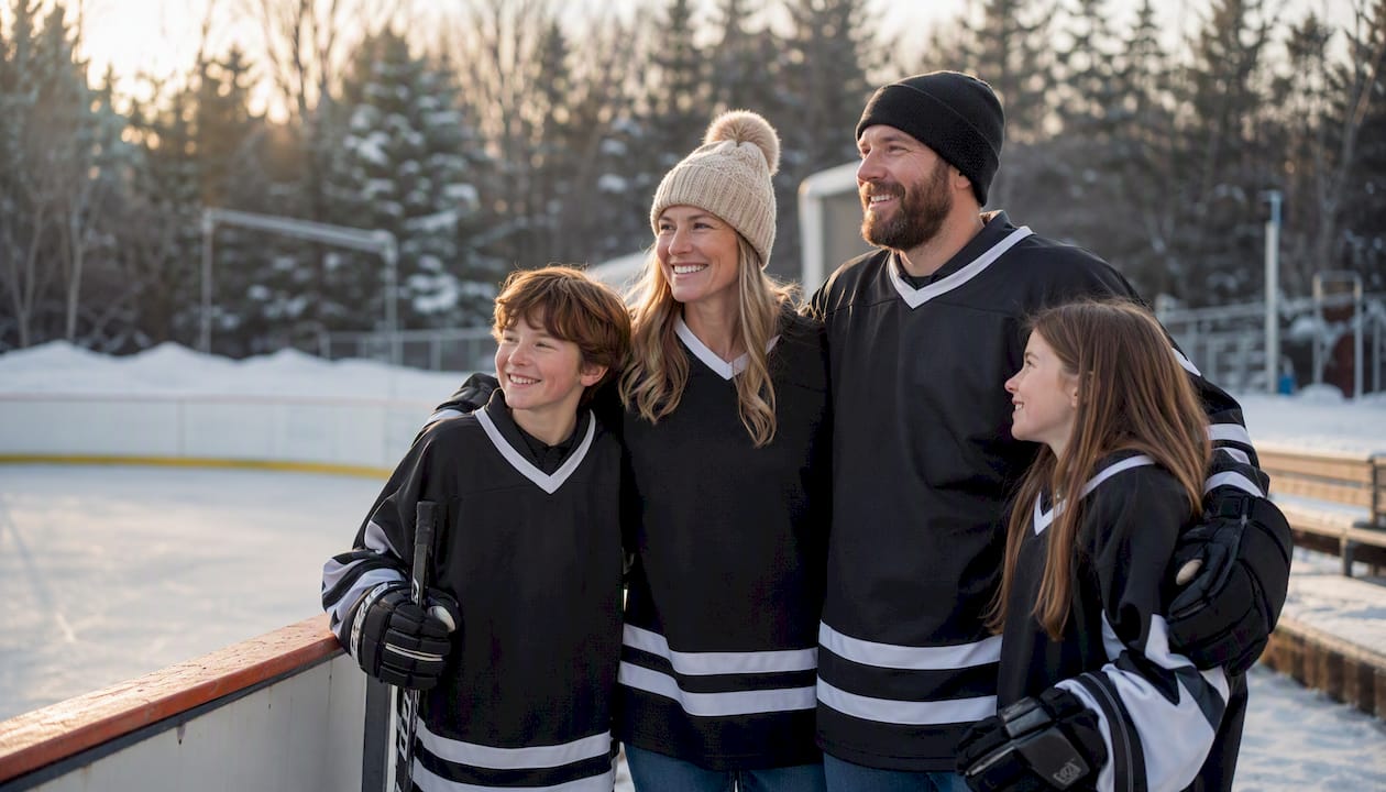
A few camera-specific rules make a real difference. Choose a dominant base color with high-contrast trim (white lettering on a dark jersey, for example) so names and numbers stay legible in action shots and posed team photos alike. Layering matters too: hoodies and long-sleeve tees photograph differently than bare jerseys, and mixing the two across a family group creates visual noise. Color psychology research on emotional and behavioral responses to hue supports the same logic teams already lean on instinctively, that a consistent color palette reads as more intentional and confident than a scattered one.
Simple photo-day prep, meaning clean gear, a consistent kit list, and clear communication with families ahead of time, is the single biggest factor in getting a sharp, coordinated team photo.
Quick photo-day guidelines worth circulating to parents:
- Match shirts within family units rather than aiming for a perfect team-wide match.
- Pick one accent color for supporters instead of trying to replicate the full uniform.
- Avoid busy patterns or logos from unrelated brands that compete visually with the team crest.
Practical Checklist for Coordinated Team and Family Apparel
The goal here is simple: get everyone visually unified with the least amount of last-minute scrambling. That means treating apparel coordination as a timeline, not a single decision made two days before the tournament.
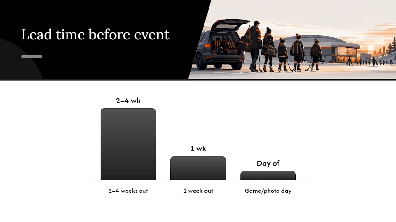
Now (design decisions): lock in team colors, logo placement, and whether names/numbers go on jerseys, hoodies, or both. Two to four weeks out: place orders and collect sizes, since custom runs need lead time and sizing mistakes are the most common source of last-minute stress. One week out: confirm every order arrived, wash and press garments, and check that supporter items match the approved color scheme. Game or photo day: assign one parent or manager as the on-site kit lead who checks layering and swaps mismatched pieces before anyone lines up for a photo.
A few things worth building into that timeline:
- Send families a single reference photo of the approved look so there’s no guessing.
- Order a few extra youth sizes since kids grow between the design phase and delivery.
- Build in an exchange window before the final deadline, not after it.
- Confirm accessory colors (hats, scarves) match the primary palette before the order closes.
Pro Tip: Put player names and numbers on jerseys but keep supporter gear generic, like team colors and a crest. It keeps the group identity strong for photos while letting each athlete keep individual recognition where it counts most.
This same personalization logic applies off the ice. Programs that lean into matching apparel for team unity tend to see stronger buy-in from families precisely because everyone, not just the players, gets a visible stake in the look.
What Should Coordinated Apparel Cost, and When Should You Order?
The fastest, lowest-friction approach is a small-batch print run for supporter items paired with full customization only on core player jerseys. That keeps costs controlled while still delivering a cohesive look.
Budget-wise, spend where it matters most. Reserve full names-and-numbers customization for jerseys, and use consistent color and logo alone on cheaper supporter tees or hoodies to stretch the budget further.
Pro Tip: No-minimum digital printing works better for smaller family orders, while bulk discounts make more sense once you’re ordering 20 or more matching pieces for a full roster.
RNK Apparel Co. Makes Photo-Ready Coordination Simple
RNK Apparel Co. builds custom hockey apparel specifically for the coordination problem coaches and families run into every season. The catalog covers the full range this article has walked through: jerseys with names and numbers, team hoodies, youth tees, and supporter accessories, all available in consistent color runs so a full roster and their families can match without guesswork.
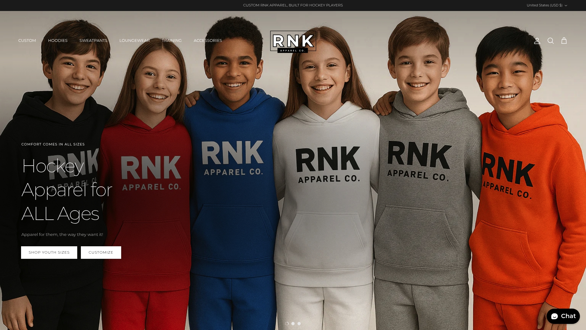
A few features line up directly with the checklist above. No-minimum ordering means a family of four can get matching hockey t-shirts without waiting on a bulk minimum, while teams needing full rosters can still access volume pricing. Youth sizing runs alongside adult sizing, so a youth hockey tee for a younger sibling can match a parent’s hoodie in the exact same color and logo placement. Accessories like hats and beanies round out the supporter look for cold rinks and outdoor tournaments.
If your team or family has a photo day, tournament, or fundraiser coming up, the practical move is to lock in colors now and place your order with enough lead time for proofing and production. Start by browsing the hockey apparel collection and get sizes confirmed with your families this week.
What I’ve Learned Watching Hockey Families Coordinate Gear
A simple, photo-forward coordination strategy beats an elaborate one every time, because the families who actually stick to the plan are the ones who found it easy to follow.
The pattern I keep seeing: teams that hand parents one reference photo and a firm order deadline end up with far more consistent results than teams that leave color choices loose “to keep it flexible.” Flexibility sounds generous, but it’s usually what produces the mismatched sideline you’re trying to avoid. For more on how this plays out with fans specifically, the RNK blog on matching family apparel covers the pattern in more depth.
Frequently Asked Questions
Why does family photo apparel coordination matter for hockey teams specifically? Coordinated apparel makes a team and its supporters visually identifiable as one group, which research ties to stronger cohesion, reduced athlete anxiety, and more professional-looking photos at games and tournaments.
What are the best colors for family and team photos? Colors with strong contrast against typical backgrounds, like a dark base with white lettering, photograph best. Research suggests red reads as more confident than yellow, though team branding should still guide the final choice.
How far in advance should we order coordinated team and family apparel? Plan for two to four weeks before the event to allow for design approval, proofing, and production, with an extra buffer for exchanges if sizing needs adjustment.
Do supporter shirts need to match the team jersey exactly? No. Matching the primary color and logo is usually enough. Full customization with names and numbers works best reserved for player jerseys rather than every supporter item.
Sources
These sources back the research and practical claims made throughout this piece:
- Thesis: Effects of Uniform Color on Perceptions (University thesis)
- Proceedings article: uniforms, identity, and athlete mental health
- The psychology of team apparel: why matching jerseys matter more than you think | Psychreg
- 4 Team Jersey Psychological Benefits That Reduce Athlete Anxiety - Sports Medicine Weekly
- How to Nail Team Picture Day Every Time
Recommended
- Why Families Wear Matching Apparel to Hockey Games – RNK Apparel Co.
- The Ultimate Guide to Hockey Parent Apparel: Style, Comfort, and Rink – RNK Apparel Co.
- Matching Hockey Family Apparel: The 2026 Trend Guide for Rink-Side Sty – RNK Apparel Co.
- Custom Hockey Apparel for a Local Team - RNK Apparel Co.
