

For reliable results, keep compact sleeve marks in the 1–3 in range on the upper sleeve or forearm, run long vertical designs centered between the shoulder seam and cuff at up to roughly 14–18 in, and never let artwork cross the underarm seam or elbow fold. Confirm every measurement on the actual blank before production, and always request an on-body proof, not just a flat mockup.
TL;DR:
- Keep sleeve designs within 1 to 3 inches wide and avoid crossing seams or folds, with measurements confirmed on the actual garment before production.
- Use the upper sleeve for logos, the forearm for secondary marks, and save vertical graphics for long text or stacked designs; placement depends on the design’s purpose.
- Size should be proportionate to the zone, typically 1 to 3 inches for short-sleeve marks and up to 18 inches long for vertical designs, adjusted for youth, women, and larger sizes.
- Tapered fabric, seams, and elbow folds limit printable width to about 2 to 3 inches and increase risks of cracking and distortion from flexing.
- Embroidery works best for small, durable marks, while screen printing and transfers suit detailed, multi-color graphics but need protection at the elbow fold for longevity.
Table of Contents
- Where should you place a sleeve print?
- What size should a sleeve print be?
- Why do seams and taper limit your design options?
- Printing vs. embroidery vs. transfers for sleeves
- What are the file setup rules for sleeve artwork?
- How do you measure and proof a sleeve print before production?
- How does Rnkapparel handle sleeve placement on team orders?
- What sleeve placement mistakes come up most often?
- Ready to put your sleeve design into production?
- Sources
Where should you place a sleeve print?
The sleeve gives you four workable zones, and each one does a different job. Pick based on what the design needs to do, not just where it looks good on a flat mockup.
- Upper sleeve/bicep: best for logos and small marks. Typically sits a few inches below the shoulder seam, stays visible in most photo angles, and clears the elbow entirely.
- Forearm: good for secondary branding or sponsor marks on jerseys. Sits below the bicep, still avoids the elbow crease if you keep it high enough.
- Cuff: reserved for tiny marks, a stripe, or a small wordmark. Almost no vertical room here, so detailed graphics get muddy.
- Vertical down-the-sleeve: the classic long-text or stacked-graphic placement, running from just below the shoulder toward the cuff.
Logos and single icons do well on the bicep or forearm. Long text, stacked lettering, or a tall graphic element needs the vertical down-sleeve treatment because there simply isn’t enough width anywhere else. For team uniforms, check your league’s sleeve marking rules before finalizing. Some sports cap how far down the sleeve a sponsor mark can sit, and photographers covering games tend to frame from the chest up, which means anything below the elbow rarely makes it into a usable shot.
What size should a sleeve print be?
Sizing depends almost entirely on which zone you’re using and whether the sleeve is short or long. Industry placement charts give a fairly tight range, and straying far outside it usually means the design either looks cramped or wraps awkwardly around the arm.
- Short-sleeve marks: typically 1–3 in wide by 1–3 in tall, centered between the shoulder seam and the hem, with about 1–2 in of clearance from the hem itself.
- Long-sleeve vertical designs: usually 2.5–3.5 in wide, running up to 14–18 in long, starting roughly 3.5 in above the cuff.
- Youth sizing: scale everything down proportionally, since kids’ sleeves run noticeably shorter and narrower in the upper arm.
- Women’s fits: often have a tighter taper through the bicep, so keep width closer to the low end of the range to avoid distortion.
- XL and up: you get more real estate, but resist the urge to simply blow up the same file. A logo that reads clean at 2 in can look bloated at 4 in if you don’t also adjust weight and spacing.
Always measure the specific blank you’re printing on. Sizing charts are a strong starting point, not a guarantee, since sleeve width varies by brand and cut.
Why do seams and taper limit your design options?
Sleeves aren’t flat panels, and that’s the root of most placement mistakes. The set-in seam at the shoulder and the underarm seam both cut into the usable flat area, and the fabric tapers as it runs down toward the wrist. On many popular tee styles, that taper and seam combination limits the truly flat printable width to roughly 2 to 3 inches, even though the sleeve looks wider from a distance.
Elbow placement is the most common failure point. Every time the arm bends, the fabric folds right where the graphic sits, and repeated flexing causes cracking, ink distortion, and early wear. Avoid it outright rather than trying to work around it.
The taper also affects legibility. Text or fine detail placed too close to the seam edges gets visually compressed as the arm narrows, so keep your key elements centered and give yourself a margin of at least half an inch from any seam or fold line.
Printing vs. embroidery vs. transfers for sleeves
The decoration method you choose determines how long the design survives and how much detail it can hold. There’s no universal winner here. It depends on the size, the color count, and how much wear the sleeve will take.
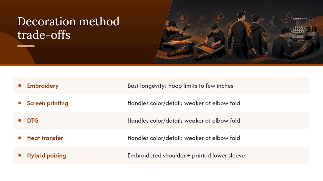
Embroidery holds up best over time and is the go-to for small, simple marks like a team crest or a single letter. Its limit is hoop size. Most commercial hoops cap out well under what a full vertical sleeve design needs, so embroidery rarely works for anything longer than a few inches.
Screen printing, DTG, and heat transfer all handle color, gradients, and finer detail far better, which makes them the right call for longer vertical graphics or anything with multiple colors. Their weak spot is durability right at the elbow fold, where repeated flexing stresses the ink layer faster than it stresses stitched thread.
When a design needs both scale and longevity, pairing a small embroidered mark near the shoulder with a printed graphic further down the sleeve often gives you the best of both without overloading either method’s weaknesses.
What are the file setup rules for sleeve artwork?
Getting a proof approved on the first pass comes down to sending files that match what the press or hoop can actually do. Vector files (AI, EPS, or PDF) are strongly preferred for logos and text because they scale cleanly to whatever the final placement size ends up being.
- Use vector artwork where possible; if raster is unavoidable, supply it at 300 DPI at final print size.
- Set colors in CMYK for print files, and flag any Pantone matches your team needs for consistency across a bulk order.
- Keep at least 0.5 in of clearance from every seam, the cuff, and the hem, and split any design that wraps around the sleeve into separate front and back panels rather than assuming continuous coverage.
- For dark garments, build in an underbase layer so lighter ink colors stay opaque instead of showing through.
Platen and hoop size vary by decorator and by machine, and confirming exact printable dimensions before finalizing artwork is one of the simplest ways to avoid a rejected proof. A design built for a 14 in platen will not fit a smaller sleeve attachment, and that mismatch is one of the most common causes of last-minute production delays.
How do you measure and proof a sleeve print before production?
Getting placement right on paper is one thing. Getting it consistent across a run of forty jerseys is another. A short, repeatable process closes that gap.
- Mark the shoulder seam and cuff edge with tailor’s chalk, then measure the midpoint to establish your vertical center line.
- Use a placement ruler or T-square to square the design against the sleeve seam, not against the fabric edge, which can shift.
- Secure the artwork or transfer with heat-resistant tape before pressing so it doesn’t shift under pressure.
- Check clearance from the underarm seam and elbow fold on the actual garment, not just the flat pattern.
- Repeat the same measurements across a size run (youth through XL) to confirm the design scales proportionally rather than just centered.
Pro Tip: Always pull one physical sample before committing to a bulk run. A flat mockup can hide how a design behaves once the sleeve curves around an actual arm, and that gap is where most placement complaints come from.
Before signing off, run through a short proof checklist: flat mockup, on-body mockup, seam clearance measurement, and a quick flex test if the garment will see heavy movement.
How does Rnkapparel handle sleeve placement on team orders?
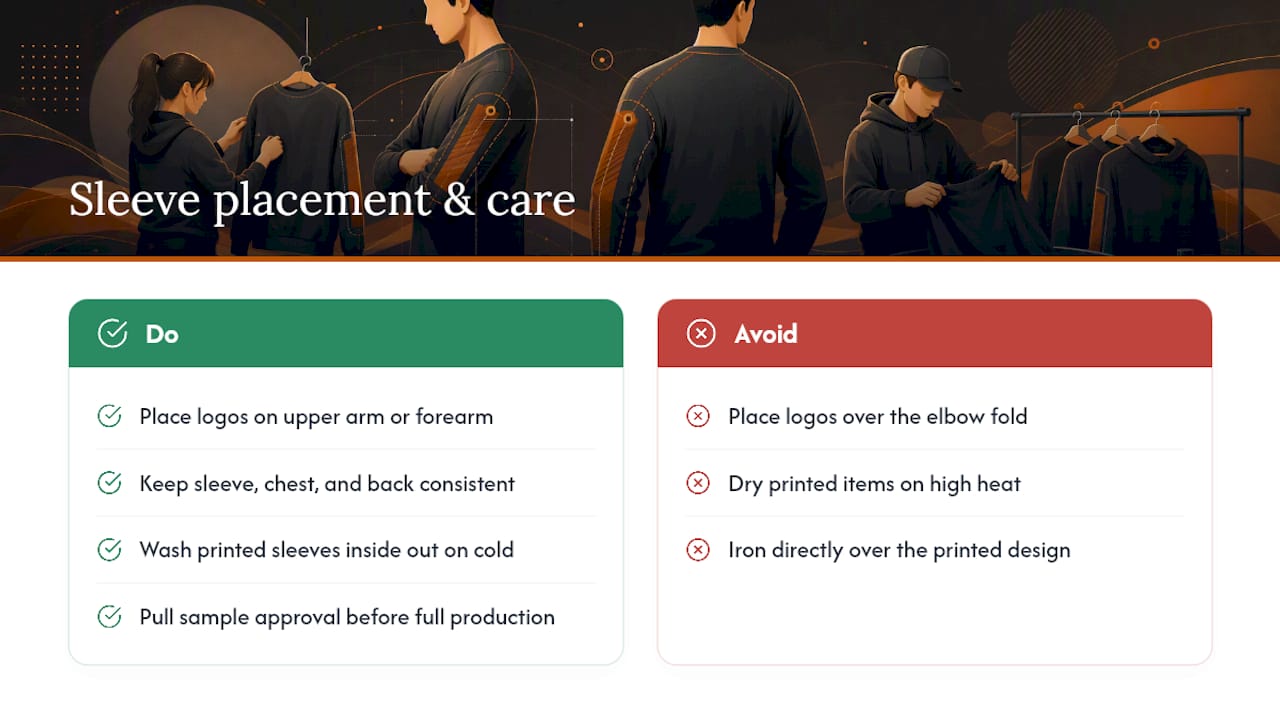
Rnkapparel keeps sleeve logos on the upper arm or forearm for team jerseys and hoodies, since that zone stays visible in game photos and clears the elbow fold entirely. For logo placement across a full uniform set, consistency between sleeve, chest, and back marks matters more than any single measurement.
Care matters as much as placement. Washing screen-printed sleeves inside out on cold, skipping the dryer’s high heat setting, and avoiding ironing directly over the design all extend the life of a screen-printed sleeve mark by years, not months.
For team runs, Rnkapparel checks size breakdowns and pulls a sample approval before full production starts, catching placement issues before forty jerseys come off the line identical.
What sleeve placement mistakes come up most often?
The same three mistakes show up over and over: artwork drawn to cross the underarm seam, a logo dropped right on the elbow because it looked fine on a flat sketch, and a method chosen for looks instead of durability. Each has a one-line fix. Move the design off the seam, shift it above or below the elbow fold, and match the method to how much flexing that spot will actually see.
If there’s one rule worth repeating for bulk orders: get a physical sample before you commit. A screen or a rendering can’t show you how fabric folds.
— Eric
Ready to put your sleeve design into production?
Rnkapparel builds custom hockey apparel around exactly the placement and sizing rules covered above, so you’re not guessing when you place an order. The team handles printing and embroidery, sends proofs before full production, and runs low-volume samples so you can check placement on the actual garment, not just a flat rendering.
To start an order, send your artwork file (vector preferred), your size breakdown by roster, and your placement specs (zone, width, and length) for each garment. Rnkapparel’s team will confirm printable dimensions against the actual blank and return a proof before anything goes into full production. For teams and individuals building a set of jerseys with matching sleeve branding, the hockey long sleeve tees collection is built specifically for this kind of vertical sleeve work. If you’d rather see how a sleeve graphic reads on a finished retail garment first, this example product page shows a similar placement approach in practice. Browse the collection, upload your files, and request a proof to lock in placement before your next team run ships.
Sources
- Printing on Shirt Sleeves: What Works | Arklavo
- T-shirt print placement size chart | Fresh Prints
- Screenprinting
- Long sleeve shirt printing: The complete guide – T-Shirt Envy Co.
