

A hockey team logo is defined as a visual symbol that encodes a team’s identity, history, and community values into a single mark. Understanding what a team logo symbolizes in hockey goes far beyond recognizing a mascot or color scheme. The best logos function as cultural shorthand, telling fans, players, and opponents exactly who a team is and where it comes from. From the Detroit Red Wings’ winged wheel to the Vancouver Canucks’ “stick-in-rink,” the symbolism of hockey logos reflects deliberate choices about place, pride, and purpose. Every element, from the animal chosen to the colors selected, carries meaning that shapes how players compete and how fans connect.
What does a team logo symbolize in hockey?
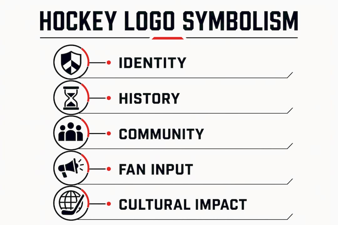
A hockey team logo symbolizes identity, belonging, and shared history compressed into one visual mark. Designers and franchise leaders treat logos as the single most visible expression of what a team stands for, which is why the design process is never arbitrary.
The most common symbolic elements in hockey logos fall into three categories.
- Animal mascots communicate aggression, speed, or regional dominance. A bear signals raw power. A shark signals predatory precision. The animal chosen almost always reflects how a franchise wants opponents and fans to perceive the team’s character on the ice.
- Geographic and cultural references root a logo in its home region. The Vancouver Canucks’ original “stick-in-rink” logo used a blue-green-white palette to represent British Columbia’s forests, ocean, and snowy mountains. Color alone carried three layers of regional meaning.
- Industrial and historical references connect a franchise to its city’s story. The Detroit Red Wings’ winged wheel directly references Detroit’s automotive manufacturing heritage. That logo appears on car bumpers, storefronts, and murals across the city, making it a civic symbol as much as a sports mark.
Hidden design elements add another layer of meaning. The Utah Mammoth logo, for example, contains a mountain-shaped crown that reinforces regional identity without demanding explanation. The best hidden elements work as standalone design features first and symbolic details second.
Pro Tip: When analyzing a hockey logo, look at the negative space and the color choices before the mascot. Those two elements usually carry the most deliberate symbolism.
How do modern branding processes and fan involvement shape logo design?
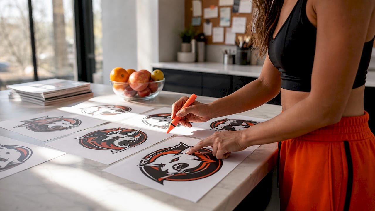
Modern hockey branding treats logo development as a community project, not a closed-door creative exercise. The Utah Mammoth’s identity went through a 13-month collaborative process involving more than 850,000 fan participants. That scale of engagement is not just a marketing tactic. It produces logos that fans feel ownership over from day one.
The NHL itself has pushed teams away from generic design choices. League pressure has discouraged clichéd “angry animal” logos, pushing franchises to incorporate regional mythology and cultural specificity instead. The result is a more diverse visual identity across the league.
Contemporary hockey branding also relies on a system of marks rather than a single logo. Professional franchises develop primary, secondary, and tertiary marks that work across jerseys, digital platforms, merchandise, and arena signage. This system keeps the brand recognizable whether it appears on a helmet or a phone screen.
Key factors that define modern hockey logo development:
- Fan voting and community input during the design phase to build emotional investment before launch
- League branding guidelines that restrict overused visual tropes and push for regional distinctiveness
- Multi-mark systems that give teams flexibility across different media without losing visual consistency
- Cultural consultation when logos draw from Indigenous or regional mythology, as seen with the Arizona Coyotes’ Hopi kachina figure
Initial fan resistance to new logos is common and expected. The San Jose Sharks and Arizona Coyotes both faced early negative reactions to their logos before those marks became iconic. Repeated exposure and emotional association with winning moments tend to convert skeptics into loyal supporters of a new visual identity.
What makes some hockey logos iconic beyond the rink?
Certain hockey logos cross from sports branding into genuine cultural symbols. Three examples define what that transition looks like.
Detroit Red Wings: the civic industrial symbol
The Detroit Red Wings’ winged wheel is the clearest example of a logo that belongs to a city, not just a franchise. Detroit’s identity as the automotive capital of America is embedded directly in the design. The registered trademark “Hockeytown” reinforces that the logo represents an entire community’s self-image. You see the winged wheel on bumper stickers, restaurant walls, and tattoos worn by people who have never attended a game. That reach defines true cultural ownership.
Phoenix Coyotes: regional mythology as design language
The Phoenix Coyotes’ Kachina logo, introduced in the 1990s, drew from Hopi cultural imagery to create something visually unlike anything else in the NHL. Designers preferred to embed local mythology rather than default to a generic coyote illustration. The result was a logo that told a story specific to the American Southwest. Thirty years later, it remains one of the most discussed and celebrated designs in hockey history.
Vancouver Canucks: minimalism as lasting identity
The original Vancouver Canucks “stick-in-rink” logo has remained relevant for over 55 years as a case study in minimalist design. Designer Joe Borovich captured a moment in visual culture by keeping the mark simple and symbolic. Simple logos age well because they do not rely on stylistic trends that date quickly. The mark’s longevity proves that symbolic economy, doing more with less, is the most durable design strategy in sports branding.
Pro Tip: The logos that last longest are the ones that could be sketched from memory by a ten-year-old. Complexity is the enemy of cultural permanence in sports identity design.
Iconic logos also extend into fan apparel and merchandise traditions, where the mark becomes the centerpiece of how fans express loyalty in everyday life. Trophies and symbols of team achievement, including logos, reinforce pride and motivation in ways that extend well beyond game day.
How do hockey logos influence team spirit, fan loyalty, and merchandise culture?
A logo’s symbolic power directly affects how players perform and how fans invest emotionally in a team. Players who wear a meaningful crest report stronger feelings of collective identity. The logo on the jersey becomes a daily reminder of what the team represents and who they are playing for.
Fan loyalty follows the same logic. When a logo carries genuine meaning, fans wear it as a statement of personal identity, not just team support. That emotional connection drives sustained merchandise demand across seasons and generations. A logo tied to real history and place sells itself.
The practical impact on merchandise culture is significant:
- Logo placement on jerseys and apparel signals professionalism and reinforces team unity. Proper logo placement on jerseys follows established branding standards that maximize visibility and visual balance.
- Fan fashion trends now treat hockey logos as streetwear graphics. Fans wear team hoodies, hats, and graphic tees as everyday clothing, not just game-day gear.
- Youth teams that invest in logo-branded apparel build team identity earlier. Young players who wear a shared mark develop cohesion faster than those in generic gear.
- Merchandise longevity depends on logo quality. A well-designed logo with clear symbolism stays in demand for decades. A generic or trend-dependent mark fades quickly.
The process of getting a team logo on custom apparel has become a standard step for teams at every level, from youth leagues to adult recreational circuits. The logo on a hoodie or hat carries the same symbolic weight as the one on a game jersey.
Key Takeaways
A hockey team logo is the single most concentrated expression of a franchise’s identity, history, and community values, and its design directly shapes player pride and fan loyalty.
| Point | Details |
|---|---|
| Logos encode identity | Every design element, color, mascot, and hidden feature communicates who the team is and where it comes from. |
| Fan engagement shapes modern logos | Processes like Utah Mammoth’s 850,000-participant development show that community input builds lasting emotional ownership. |
| Iconic logos cross into civic culture | The Detroit Red Wings’ winged wheel and Vancouver Canucks’ “stick-in-rink” prove that great logos become city symbols, not just sports marks. |
| Multi-mark systems extend brand reach | Primary, secondary, and tertiary marks keep a logo consistent across jerseys, merchandise, and digital platforms. |
| Logo symbolism drives merchandise demand | Fans buy and wear apparel featuring logos that carry real meaning, sustaining merchandise culture across generations. |
Why logo symbolism matters more than most teams realize
I have spent years watching teams treat their logo as an afterthought, a quick graphic slapped on a jersey before the season starts. That approach costs them something real. The teams that invest in meaningful logo design, the ones that connect their mark to a place, a history, or a community value, build something that outlasts any single season or roster.
What strikes me most is how fans respond to symbolism they can feel, even if they cannot articulate it. The Phoenix Coyotes’ Kachina logo faced early resistance, but fans who grew up with it now defend it with genuine passion. That is not nostalgia. That is what happens when a logo earns its meaning over time through shared experience.
The lesson for coaches and team managers is straightforward. A logo is not decoration. It is the first thing your players see when they pull on a jersey and the last thing opponents see when you skate past them. Make it mean something specific to your team, your city, and your players. Generic marks produce generic pride. Specific symbols produce the kind of identity that players carry with them long after they hang up their skates.
— Eric
Bring your team logo to life with Rnkapparel
Your team’s logo deserves to show up on more than just a jersey. Rnkapparel specializes in custom hockey apparel for teams across the United States and Canada, putting your logo front and center on gear your players and fans will actually wear.
From custom hockey graphic tees to custom team hats and custom hockey hoodies, Rnkapparel handles the full range of team apparel with professional logo placement and quality materials built for the rink and the street. Upload your logo, choose your colors, and add player names and numbers. Rnkapparel takes care of the rest, so your team looks unified from the first warmup to the final buzzer.
FAQ
What does a hockey team logo symbolize?
A hockey team logo symbolizes the team’s identity, history, and community values through deliberate design choices including animal mascots, regional colors, and cultural references. Every element communicates something specific about who the team is and where it comes from.
Why do hockey teams use animal mascots in their logos?
Animal mascots communicate traits like aggression, speed, or regional dominance that teams want to project on the ice. The choice of animal is rarely random; it reflects the character and competitive identity the franchise wants to establish.
How do fans influence hockey logo design?
Modern franchises actively involve fans through voting, surveys, and community feedback during logo development. The Utah Mammoth’s identity process engaged more than 850,000 participants over 13 months, producing a logo with built-in community ownership.
Why do some hockey logos become cultural symbols beyond sports?
Logos that connect to a city’s history or regional identity, like the Detroit Red Wings’ winged wheel referencing Detroit’s automotive heritage, become civic symbols that fans adopt in everyday life well beyond the arena.
How long does a well-designed hockey logo last?
A minimalist, symbolically strong logo can remain relevant for decades. The Vancouver Canucks’ original “stick-in-rink” design has endured for over 55 years, proving that simplicity and clear symbolism outlast trend-driven design choices.
