
Consistent team apparel comes down to five fixed rules: set logo placements, a limited color palette, block-style numbers, proportional scaling across sizes, and a required preflight checklist before any order goes to print. A signed proof and correctly scaled artwork stop most mistakes before they cost you a reorder. Made-to-order hockey apparel built around these same rules is available, so teams that want help do not have to start from scratch.
TL;DR:
- Proper logo placement and consistent clear space are crucial to maintain a unified team appearance and avoid visual warping or competing graphics.
- Limiting the color palette and ensuring high contrast between numbers and jersey backgrounds significantly improve legibility under arena lighting conditions.
- Artwork must be scaled proportionally for each size in the order, with mockups reviewed at both ends of the size range to prevent design misfit or cropping issues.
- A strict preflight process involving signed approvals, mockups, and configuration checks helps prevent costly errors, reorders, and design inconsistencies.
- Using one approved vendor with built-in support for artwork scaling and mockup review streamlines the process and maintains brand consistency across all apparel and accessories.
Table of Contents
- Quick team branding checklist you can follow now
- Logo placement and clear space rules for jerseys and apparel
- Choosing team colors that stay readable on ice
- Getting player names and numbers right: fonts, size, and stroke
- Scaling artwork correctly across your full size run
- Preflight, approvals, and vendor workflow
- Applying your identity to hoodies, hats, and bags
- Keeping your brand consistent season after season
- Uniform patch placement and specifications
- Material and fabric considerations for branding durability
- Branding on goalie equipment and accessories
- Why strict rules save time, money, and headaches
- How RNK Apparel Co. supports your team’s branding
- Sources
- FAQ
Quick team branding checklist you can follow now
Before you approve any design, run it against a short list. This is the same structure institutional programs use in their athletics branding toolkits, scaled down for a club team.
- Primary logo sits in one fixed chest position, with an approved alternate mark for smaller spaces.
- Clear space around the logo is defined and never crowded by text or numbers.
- Color pairs are locked: one primary, one secondary, one accent, each with a documented hex or Pantone code.
- Numbers and names use a block-style font with confirmed contrast against the jersey color.
- Preflight covers file type, size-run scaling, a mockup photo, and a signed approval before production starts.
Print a sample garment or mockup and hold it under normal lighting before you sign off. A screen preview almost never matches what the color looks like on fabric.
Pro Tip: Keep a one-page checklist taped inside your equipment bag so any parent volunteer placing a reorder follows the same rules you approved.
Logo placement and clear space rules for jerseys and apparel
Placement consistency is what makes a full bench look like one team instead of twelve individual orders. Set these positions once and reuse them for every jersey, hoodie, and hat you order.
- Primary logo centers on the chest at a consistent height below the collar appropriate for the garment size.
- Back placement holds the number as the dominant element, with the team name arched above it, never behind or overlapping.
- Sleeve marks stay small and secondary: a shoulder patch or alternate mark, not the full primary logo.
- Hat placement is front and center on the crown panel, sized to the embroidery area rather than stretched to fit.
- Clear space proportional to the logo’s size should stay open on all sides, with no text or graphic crossing that boundary.
Avoid placing any logo over a seam or a curved panel, since the shape will warp once the garment is worn. Never run a pattern or secondary graphic behind the number. This same reasoning applies to sponsor marks: give them a fixed, smaller position (commonly a sleeve or lower back) and never let a sponsor logo compete with the team’s primary mark for size or placement. Our logo placement guide walks through chest, sleeve, and back positioning in more detail.
Choosing team colors that stay readable on ice
Rink lighting is unforgiving. A color combination that looks sharp on a monitor can flatten out under arena lights, so keep the palette simple and the contrast obvious.
- Limit the palette to one or two primary colors plus a single accent color.
- Pair light numbers on a dark jersey or dark numbers on a light jersey. Avoid mid-tone combinations that blur together.
- Keep the area around numbers and names free of busy patterns, gradients, or textured graphics.
- Take a quick photo mockup under indoor lighting before approving, since screen colors shift once printed on fabric.
- Document any approved alternate colors (for a tournament jersey or theme night) with a start and end date, so the exception does not become the new default.
University brand manuals commonly set minimum size and color-usage rules specifically to protect legibility across every application, from jerseys to signage, according to the University of Georgia Athletics Brand Manual. Amateur teams can borrow the same logic: fewer colors, stricter contrast, fewer exceptions. Our team color combinations guide has ready palettes if you want to skip the trial and error.
Getting player names and numbers right: fonts, size, and stroke
Numbers need to read clearly from the far blue line, so this is not the place for a decorative or script font. Stick to a clean, block-style numeral with a consistent stroke width across every size in your order.
- Use a solid block or athletic-style number font, never a script, serif, or hand-drawn style.
- Keep the stroke thick enough to hold up at distance. A number that looks fine up close often disappears once it is thirty feet away.
- Center the number on the back, with the player’s last name arched above it in matching capitalization, either all capitals or title case, but never mixed within the same set.
- Watch kerning on longer names so letters do not crowd together or touch the number below.
Our jersey name placement guide includes a seven-step measuring method if you want exact positioning rather than eyeballing it.
Scaling artwork correctly across your full size run
The single most common branding mistake on a team order is reusing one art file across every size. A logo sized correctly for an adult large will look tiny and off-center on a youth small, or get cropped on an adult 3XL.
- Request scaled art per size band (youth, small adult, large adult) rather than one universal file.
- Ask your vendor for vector files with outlined text, along with Pantone, RGB, and hex values for every color in the design.
- Request a mockup for at least one size at each end of your run before the full order is placed.
- Confirm placement measurements scale proportionally, not just the logo’s overall size.
Graphics have to be scaled proportionally across the size run, since using identical dimensions for a youth small and an adult 3XL causes the design to look too small or get cut off, according to Printful’s sizing guidance. This is standard production practice, not a preference, and any vendor worth using will already build scaling into their process.
Pro Tip: Ask to see a side-by-side mockup of your smallest and largest sizes before approving the full run. If the logo looks proportionally different between them, send it back.
Preflight, approvals, and vendor workflow
A clear approval sequence is what separates a smooth team order from a reorder that eats your budget. Follow the same steps every time, regardless of who on your team is placing the order.
- Review an initial digital mockup against your approved logo, colors, and placement rules.
- Request size-run mockups covering at least your smallest and largest sizes.
- Approve a test print or physical sample when color accuracy matters, such as for a new primary color.
- Collect one signed, dated approval from a single named person before production starts.
If your team plays under a club or league umbrella, check whether a brand steward or association policy applies before finalizing anything. Association-level apparel policies commonly require approved colors, approved logos, and ordering only through a licensed vendor, according to the OMHA apparel policy. When a vendor constraint conflicts with what you want, put the exception request in writing and get it approved before ordering rather than after.
Applying your identity to hoodies, hats, and bags
Non-jersey apparel should feel like part of the same team, not a separate product line. Use your primary logo on hoodies where there is room for it, and switch to a simplified secondary mark on smaller items like hats and bags.
- Hoodies carry the primary logo on the chest, matching jersey placement and clear space rules.
- Hats and small accessories use a single-color version of the logo, since embroidery and small prints lose detail fast.
- Bags work best with a simplified mark placed on a flat panel, away from zippers or seams.
- Any team store merchandise should pull directly from the same approved art file used for the uniform, not a separate version created on the fly.
Our coach’s guide to youth hockey team gear covers this in more depth for teams building out a full apparel line.
Keeping your brand consistent season after season
The easiest way to avoid drift is a single named approver and one central folder for approved art, color codes, and mockups. Name files with a version number, so nobody accidentally reorders from an outdated logo file.
Document any temporary alternate, like a tournament color or a memorial patch, with an expiration date attached. Log every exception in one place and pass that same document to your vendor before each order, rather than repeating instructions from memory each season.
Uniform patch placement and specifications
Patches, whether commemorative, sponsor, or league-required, need their own fixed rules the same way logos do. A patch placed inconsistently across a roster makes even a well-designed jersey look unfinished.
- Shoulder patches (left or right, pick one and stay consistent) typically sit about an inch below the shoulder seam, sized to roughly 3 to 4 inches depending on the garment.
- Chest patches, when used instead of a printed logo, follow the same centering rules as a printed chest mark and should not overlap the collar or front seam.
- Memorial or commemorative patches usually go on the opposite shoulder or the helmet, kept small enough that they do not compete with the primary logo for attention.
- Sponsor patches belong on the lower sleeve or lower back, sized noticeably smaller than the team’s primary and secondary marks.
Specify patch size, position, and attachment method (sewn, heat-pressed, or embroidered) in writing before ordering, since these details affect both cost and durability. A sewn patch holds up better over a full season of practices and travel than a heat-pressed version, though it costs more per unit and takes longer to apply. If your league or association has its own patch requirements, confirm them before finalizing your uniform order, since some associations mandate specific placement for league patches regardless of your own design preferences.
Keep a reference photo of correct patch placement in your central team file, the same way you store your logo and color specs. That way a new parent volunteer ordering a replacement jersey mid-season places the patch in the same spot as everyone else’s.
Material and fabric considerations for branding durability
The fabric underneath your logo affects how long that logo actually looks good. A print or patch that looks sharp on day one can crack, peel, or fade fast on the wrong material.
Moisture-wicking polyester blends, common in performance jerseys and warmups, hold screen prints and sublimated graphics better than cotton, which tends to let ink bleed or crack faster with repeated washing. Heavier cotton fleece, typical in hoodies, holds embroidery and larger prints well but is a poor match for very fine detail, since the texture of the fabric limits how sharp small text or thin lines can look.
Sublimation, where dye is infused directly into the fabric rather than printed on top, tends to hold up longest on jerseys because the graphic will not crack or peel with washing. Screen printing costs less and works well for simpler, larger graphics on tees and hoodies but degrades faster under heavy wash cycles. Embroidery is the most durable option for small marks like hat logos, though it is not practical for large, detailed graphics or gradients.

Ask your vendor which application method fits your fabric choice before finalizing artwork, since a design built for sublimation will not translate directly to embroidery. Building this into your preflight checklist alongside file format and color specs prevents a durability problem from showing up only after the whole team has already worn the gear a few times.
Branding on goalie equipment and accessories
Goalie gear follows the same identity rules as skater jerseys, but the surfaces are different enough to need their own approach. A goalie’s chest protector, pants, and mask do not take a standard screen print the way a jersey does.
Chest protectors and pants typically carry team colors through the fabric or shell itself rather than a printed logo, so your main branding opportunity is the goalie jersey, which should follow the same chest and back placement rules as the rest of the team. Helmets and masks are usually painted separately by a specialist and are not part of a standard apparel order, so treat mask artwork as its own project with its own approval step rather than folding it into your jersey preflight.
For goalie bags and accessories, stick to the same simplified, single-color mark used on other small items like hats. A goalie’s gear bag is large enough to carry the full primary logo clearly, so there is no need to shrink or simplify it the way you would for a hat.
Keep goalie jersey sizing on the same preflight checklist as skater jerseys, since goalie cuts run larger and need their own scaling check rather than an assumption that “adult large” means the same thing across both cuts.

Why strict rules save time, money, and headaches
A few fixed rules up front save far more time than they cost. Every reorder I have seen traced back to skipped preflight steps: a size not scaled, a color not confirmed, an approval nobody signed. Our blog has more procedural templates if you want to build this out further.
— Eric
How RNK Apparel Co. supports your team’s branding
Building a consistent kit is easier when production and preflight happen under one roof. Made-to-order hockey apparel with artwork support and size-run scaling built into the process is available, so the checklist above is not something you have to manage entirely on your own.
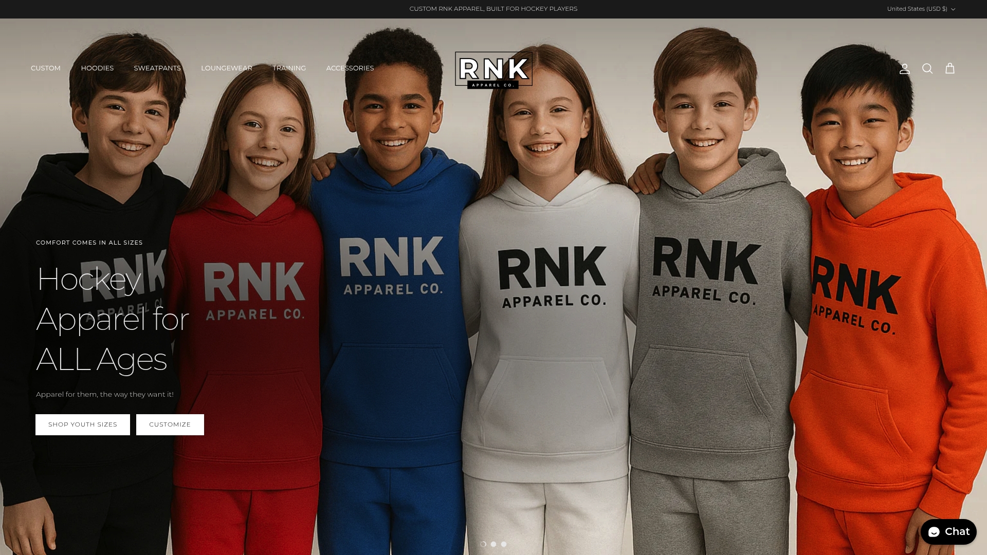
- Upload your team logo once and apply it consistently across hoodies, tees, and headwear.
- Scale artwork correctly across a full youth-to-adult size run without manually resizing each file yourself.
- Get a mockup to review and approve before your order goes into production.
Start your team’s order or browse custom hockey apparel to see how a preflight-ready workflow looks in practice.
Sources
- How is my design scaled for different garment sizes
- Athletics Brand Guidelines and Toolkit - Brand Guidelines
- University of Georgia Athletics Brand Manual
FAQ
What size should hockey jersey numbers be?
Number size depends on the garment and age group, but the priority is legibility from a distance rather than a fixed measurement. Follow your vendor’s recommended sizing per garment size and confirm it with a mockup before ordering, since the same number size that looks right on an adult jersey will look oversized on a youth cut.
What file format should I send for team logo artwork?
Vector files with outlined text are the standard request, since they scale cleanly across every garment size without losing quality. Include Pantone, RGB, or hex color values with the file so your vendor can match colors exactly, as recommended in athletics branding toolkits.
Who should give final approval before a team apparel order is placed?
One named person, whether the coach, manager, or a designated parent volunteer, should give the final signed approval on every order. This prevents the drift that happens when several people approve slightly different versions of the same design across a season.
Do I need a licensed vendor for team apparel?
If your team plays under a club or league umbrella, check that organization’s own policy, since many require ordering through an approved or licensed vendor, as seen in the OMHA apparel policy. Independent teams without a governing policy can choose any vendor, but should still confirm the vendor follows proper preflight and proofing steps.
Can I use different colors for a tournament or special event jersey?
Yes, as long as the alternate color is documented as a temporary exception with a clear start and end date. Keep your standard palette as the default and treat any event colors as a logged, approved departure rather than a permanent change to your team’s identity.
